Important: Chrome will be removing support for Chrome Apps on Windows, Mac, and Linux. Chrome OS will continue to support Chrome Apps. Additionally, Chrome and the Web Store will continue to support extensions on all platforms. Read the announcement and learn more about migrating your app.
Supplying Images
You need to supply several kinds of images to be used in the Chrome Web Store and the Google Chrome browser:
Only the app icon, a small promotional image, and a screenshot are mandatory. However, providing attractive versions of both required and optional images increases your app's chances of getting noticed. For example, your app can't be featured unless you provide a large or marquee promotional image.
App icon
You must provide a 128x128-pixel app icon image in the ZIP file of your app. Some requirements for the image:
- The actual icon size should be 96x96 (for square icons); an additional 16 pixels per side should be transparent padding, adding up to 128x128 total image size. For details, see Icon size.
- The image must be in PNG format.
- The image should work well on both light and dark backgrounds.
Since Chrome 15, the image that you provide is dynamically resized in the New Tab page. Its size is determined by the overall browser window size.
Note: To make sure your icon looks good, preview your app's listing in the Chrome Web Store. If you're working on an installable web app, you also need to view your icon in the New Tab page. To do so, you can load the unpacked app, bring up the New Tab page, and then look at the icon against a variety of backgrounds by applying a few themes.
When you design the icon, keep the following advice in mind:
- Don't put an edge around the 128x128 image; the UI might add edges.
- If your icon is mostly dark, consider adding a subtle white outer glow so it'll look good against dark backgrounds.
- Avoid large drop shadows; the UI might add shadows. It's OK to use small shadows for contrast.
- If you have a bevel at the bottom of your icon, we recommend 4 pixels of depth.
- Make the icon face the viewer, rather than having built-in perspective. See Perspective for details.
Here are some icons that follow these guidelines.


Note: If you upload an image that has no alpha, it will be placed in a frame with rounded corners (12-pixel corner radius).
Icon size
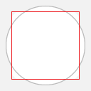
All app icons should have the same visual weight, occupying roughly the same area. As the following figure shows, when you size an icon to fill the available area, square and circular icons are significantly larger than they should be, compared to icons with other shapes.

Normalizing the icon sizes, as the next figure shows, gives the icons roughly even area and visual weight.

You can use the following template images to help you judge how large your image's artwork should be. The templates show the correct size for a square and a circle, but these are merely guides; icons that have pointy bits might stray outside these areas. If an irregularly shaped icon takes up very little area and is mostly negative space, using the entire 128x128 area might be acceptable.
 |
 |
 |
| Template for square icons | Template for circular icons | Template for irregular icons |
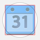
You can follow some rules of thumb for artwork size. For a square icon, make the artwork 96x96 pixels. For other icons that are squarish, make the artwork's width 75-80% of the total width of the image. A circular icon should have a diameter of approximately 112 pixels, or 85% to 90% of the image width. Icons with irregular shapes should have similar weights.
The following figures show square and circular icons, comparing them with the templates.

Here's an example of an irregularly shaped icon. In this case, the icon follows neither the square nor circular guidelines, but it fits near them both.

Perspective
For flexibility and consistency, app icons should be front-facing. Subtle tweaks of perspective that give a sense of tangibility are OK, but avoid dramatic angles.

|

|

|

|
| Good icons (front facing) | Bad icons (too-drastic perspective) |
Promotional images
You must provide one small, 440x280-pixel promotional image. You can also provide other images that the store can use to promote your app.
Note: Unlike screenshots, promotional images are not currently locale-specific. If your app supports multiple locales, we recommend either avoiding text by focusing on graphical representations of the app's capabilities, or targeting the promo images to the locale in which you have the most users.
Note: If your images refer to Google brands, follow the Branding Guidelines.
Although only a small promotional image is required, you can also supply larger promotional images if you'd like your app to be featured more prominently in the Chrome Web Store. You can provide one of each of the following:
- Small: 440x280 pixels (required)
- Large: 920x680 pixels
- Marquee: 1400x560 pixels
Note: Apps that don't have a small promotional image will be shown after apps that do have that image. If your app was published before the small promotional image was required, you should add that image so your app can be displayed more prominently.
Promotional images are your chance to capture users' attention and entice them to learn more. Don't just use a screenshot; your images should primarily communicate the brand. Here are some rules of thumb for designing your images:
- Avoid text.
- Make sure your image works even when shrunk to half size.
- Assume the image will be on a light gray background.
- Use saturated colors if possible; they tend to work well.
- Avoid using a lot of white and light gray.
- Fill the entire region.
- Make sure the edges are well defined.
The following graphics are examples of the promotional images for an app:
|
|
| Small promo image (440x280) (full size) | Large promo image (920x680) (full size) |
|
| Marquee (1400x560) (full size) |
Note: You can find the review status of your promo image in each item's listing within your developer dashboard. Click on 'Edit' on the item's listing, and scroll down to the Promotional Images section. If you have questions about the status of your promo images, contact cws-assets@google.com.
Here is a description of the review statuses:
- Pending Review status: The image has not yet been reviewed, and is not being displayed in the store. Images should be reviewed within one week from submission.
- No status: The image has been approved, and is being displayed in the store. [*Images from 'Draft' or 'Trusted testers' items will not show an image status. You will need to publish the item in order to get your promo image approved.]
- Rejected: The image has been reviewed and rejected, and is not being displayed in the store. The reason(s) for rejection will be displayed in the Promotional Images section of the item's Edit page. We encourage you to review the reasons, and to make the necessary changes before re-uploading new improved images. New uploaded images will immediately have a Pending Review status.
Screenshots
You must provide at least 1—and preferably the maximum allowed 5—screenshots of your app to be displayed in the app's store listing. If your app supports multiple locales, you can provide locale-specific screenshots as described in Internationalizing Your App.
When you edit your app's listing, mousing over a screenshot's thumbnail brings up controls that let you delete the screenshot or change its position.
Each screenshot should be as follows:
- Square corners, no padding (full bleed)
- 1280x800 or 640x400 pixels
Note: 1280x800 screenshots are preferrable, as larger screenshots look better on high-resolution displays. Currently, all screenshots are downscaled to 640x400 pixels. If your screenshots do not look good when downscaled (for example, they have a lot of text) or if 1280x800 is too big for your app (for example, screenshots for a low-resolution game), you can upload 640x400 screenshots.
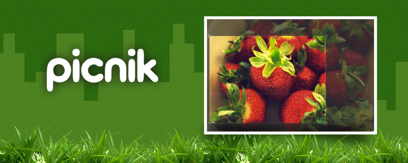
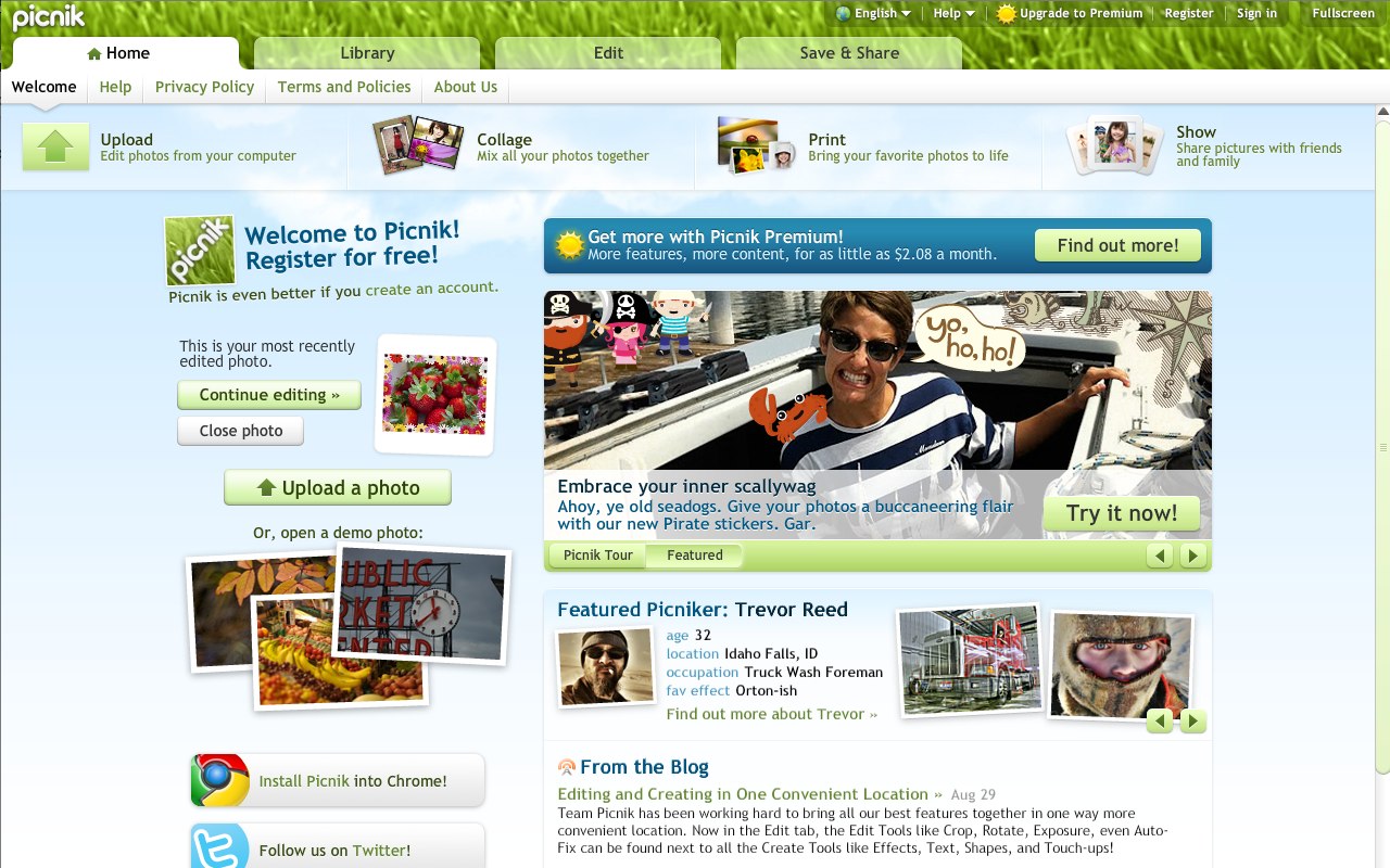
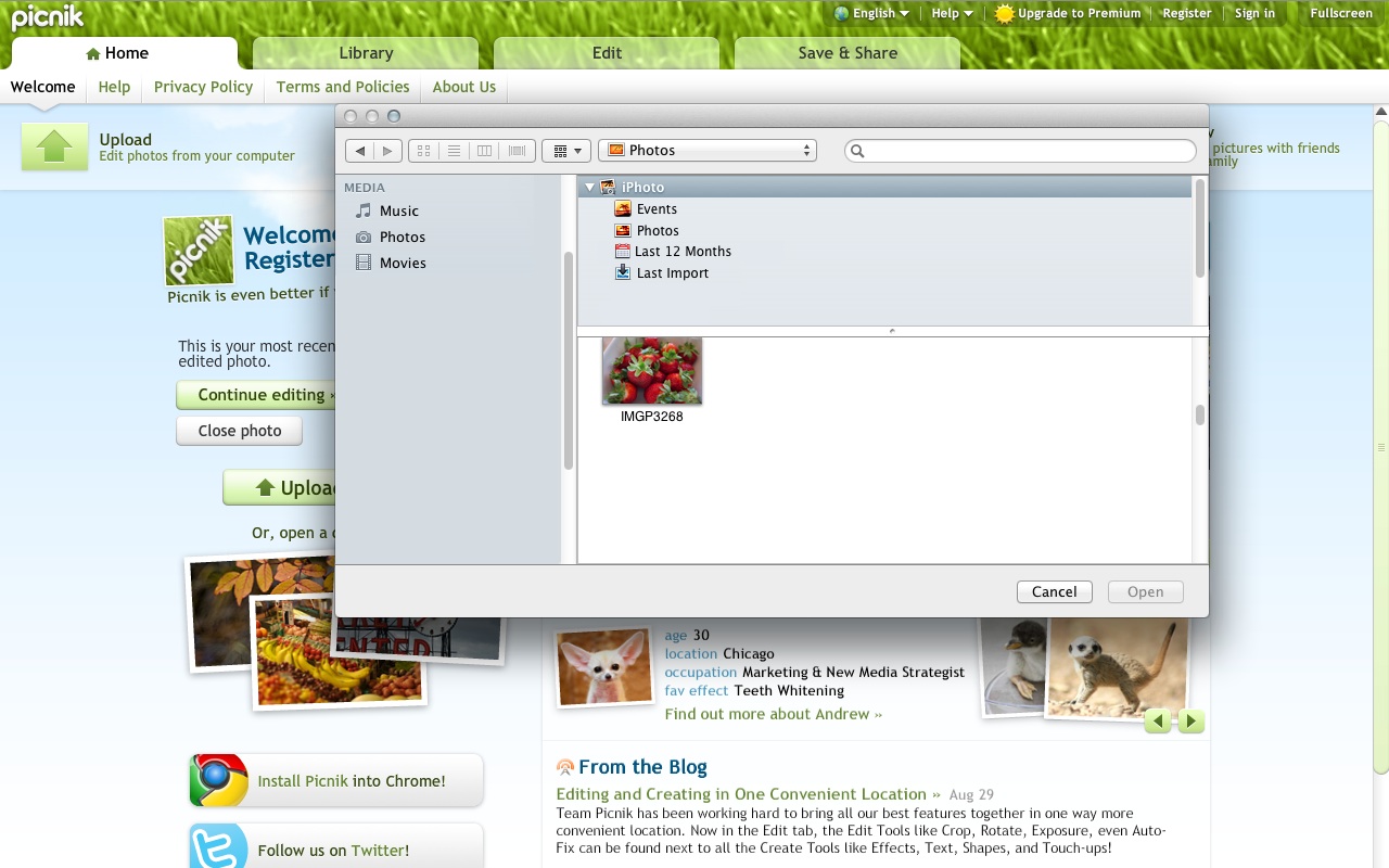
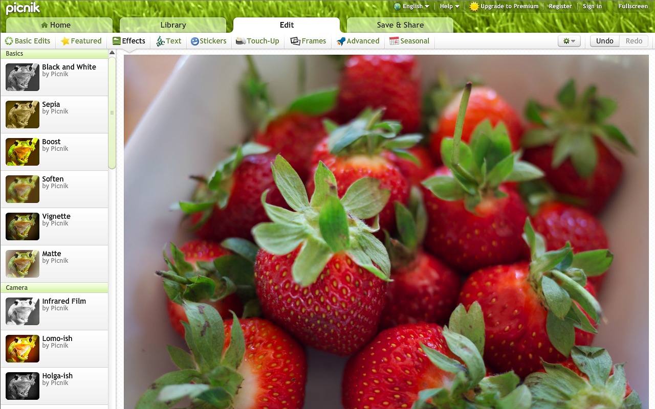
As an example, here are five screenshot images for an app:
|
|
| Screenshot #1 (full size) | Screenshot #2 (full size) |
|
|
|
| Screenshot #3 (full size) | Screenshot #4 (full size) | Screenshot #5 (full size) |
What next?
Next, read Publishing Your App.